 XIA LEI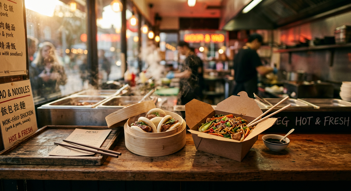
A quick word about the food
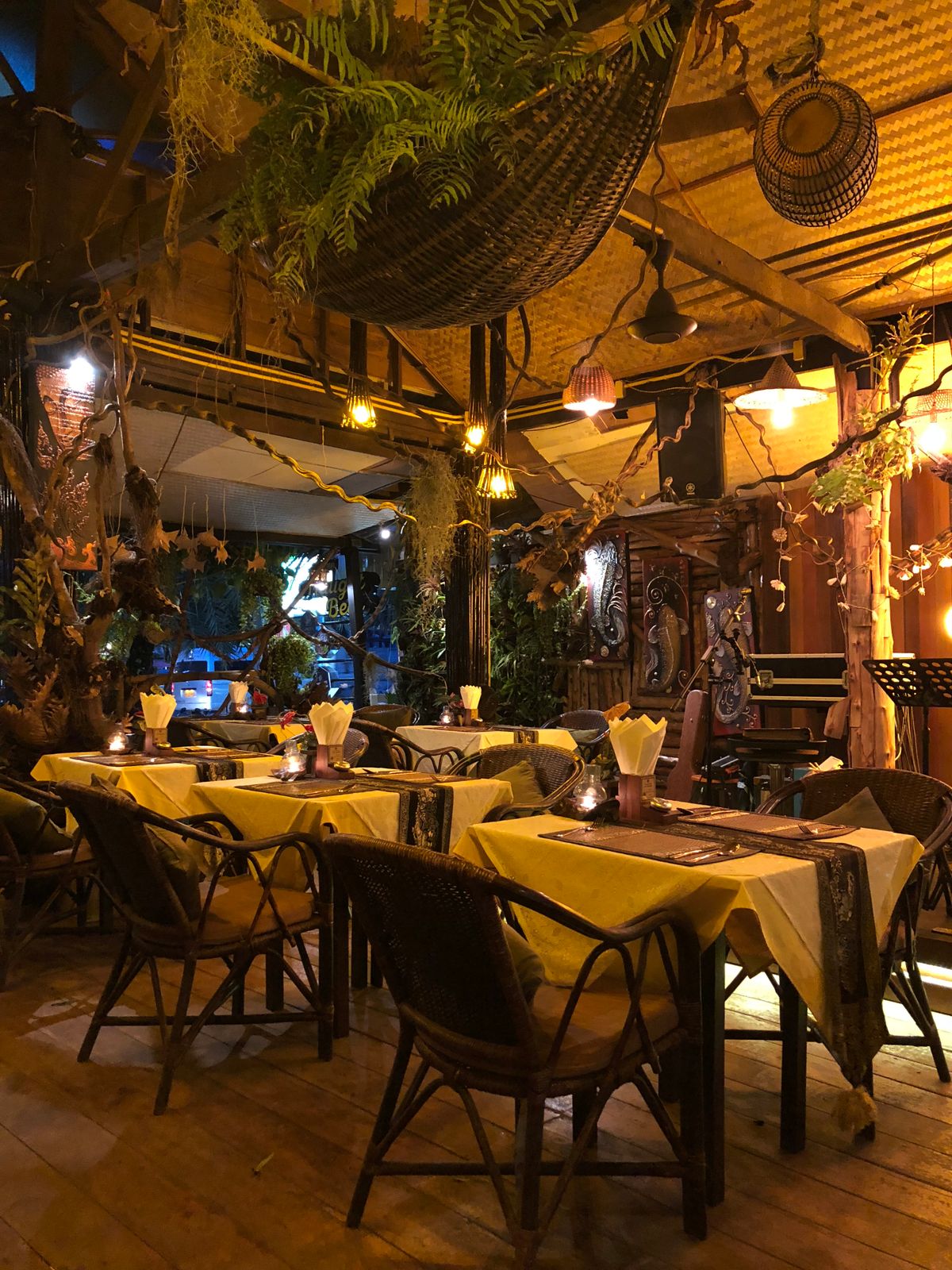
Before the tech: Eskinita is genuinely good. It is an Asian takeaway with a short, punchy menu, big flavours, and a team that clearly enjoys what they do. Every time I dropped in for a build review, the kitchen was moving fast, the front-of-house was friendly, and someone quietly put a container of something delicious in my hand before I left. That kind of hospitality is the reason I said yes to the project.
I was engaged by the director of the parent company to design and build the new website, with limited UX designer support — meaning I had to wear both hats for most of the day-to-day decisions, and only bring in design help for the moments that really needed a second pair of eyes.
What the site had to do on the surface
From a customer point of view, the brief was simple. The site had to:
- Show the full menu in a way that is fast to scan on a phone at 6pm on a Friday, when a decision needs to be made in twenty seconds.
- Let people order for delivery through Uber Eats and Hungry Panda without breaking the flow.
- Take card payments directly on the site through Tyro, so pick-up and pre-paid orders do not have to route through a third-party marketplace at all.
- Make it obvious what is on promotion right now, without turning the homepage into a coupon jungle.
- Feel like Eskinita — the warmth, the food, the little jokes on the menu — not like a generic templated restaurant site.
Everything you see on the customer side is built in React, tuned for mobile first, and deliberately quiet: high-contrast product photography, tight typography, and no gratuitous animation between the customer and the order button.
What is actually running underneath
The interesting part of this project was never the marketing pages. It was the back office. Eskinita is a real, small, busy business, and I did not want the owner to end up juggling six SaaS tools every week. So the same React application backs a proper operator console, with these modules stitched together:
Custom content management system
A tailor-made CMS built for this business, not a repurposed WordPress plugin. Staff can:
- Edit the menu — items, prices, allergens, photos, availability — from any device.
- Push a change to the live site instantly without redeploying anything.
- Manage the homepage sections, the "About" story, and the legal pages from a single place.
The CMS is intentionally small. It does exactly what Eskinita needs and nothing else.
Staff shift system
A lightweight rostering module built into the same admin area:
- Managers publish weekly shifts.
- Staff see their upcoming shifts on their phones and confirm or request swaps.
- The system tracks who worked when, which feeds directly into the accounting module.
Payment system (Tyro on the site, Uber Eats and Hungry Panda for delivery)
Three integrated flows, one clean checkout:
- Direct pick-up / prepaid orders: pay through Tyro on the site.
- Delivery: routed through Uber Eats and Hungry Panda, deep-linked from the same menu.
- Every completed transaction — Tyro, Uber Eats, Hungry Panda — is normalised into a single order feed the manager can watch in real time.
Coupon system
Discounts done properly:
- Single-use, multi-use, and time-bound codes.
- Percentage off, dollars off, or free-item promotions.
- Optional rules for minimum spend, specific items, and channel (dine-in, pick-up, or delivery).
- Each redemption is logged so nothing "disappears" from the books.
Basic accounting system
Not a full ledger — just enough to keep the owner honest and the accountant happy:
- Daily sales, split by channel and payment method.
- Refunds, voids, and coupon impact broken out separately.
- Simple export for the external bookkeeper at month end.
Food promotion system
The bit the marketing brain enjoys:
- Schedule a promotion in advance ("Chilli Wontons, half price, Wednesday 5pm to 9pm") and it appears on the site automatically.
- Promotions can be pinned to the homepage, threaded into the menu, or shown only to returning customers.
- Every promotion has an expiry — no forgotten banner sitting on the site three months later.
All of this lives behind one admin login, on the same React codebase as the customer site.
Working with a limited UX designer
Here is the honest bit. On this project I did not have a full-time UX designer sitting next to me. I had limited access to a UX designer, which meant I had to be disciplined about when to spend that resource.
The pattern that worked:
- I designed the boring 80%. Anything that had a well-understood pattern — menu grids, checkout, admin tables, form layouts — I built directly, borrowing shape and rhythm from restaurant sites I trust.
- UX time went to the 20% that mattered. The moment a customer hits "Order", the moment a manager writes a promotion, the moment a staff member reads their next shift on a small phone in a hot kitchen. Those got proper attention, sketches, and iteration.
- The owner was the tiebreaker. When there was a disagreement, the person who actually runs the business made the call, not me. That saved a lot of arguments and produced better decisions.
The result is a site that does not look like it was designed by one person alone, because the parts that had to feel considered got the help they needed, and the parts that just had to work did not waste anyone's time.
Why React, and how it stayed sane
Choosing React for the whole thing — customer site and admin console — kept the project simple in the ways that mattered:
- One codebase. One set of components, one build pipeline, one deploy.
- Shared primitives. The same button, the same modal, the same form field on the menu page and in the shift editor. Consistency is free.
- Fast iteration. When Eskinita wants a new promotion type or a tweaked checkout, it is a small change in a place I already understand, not a hunt across three vendors.
What I took away from this build
Three things worth writing down:
- Small businesses do not need enterprise software. They need a couple of well-integrated modules that speak to each other and to the humans running the shop.
- Delivery marketplaces are partners, not the whole business. Uber Eats and Hungry Panda bring reach; a direct Tyro checkout keeps the margin sane. A good site uses both without hiding either.
- The best brief comes from the team. The kitchen staff, the front-of-house, and the director each caught things I would not have seen. Building close to the people who use the software is not a nice-to-have.
If you are hungry and you are near Eskinita — go. Order something spicy. And if you build small-business software for a living, poke around the site; a lot more is happening under the hood than the menu lets on.